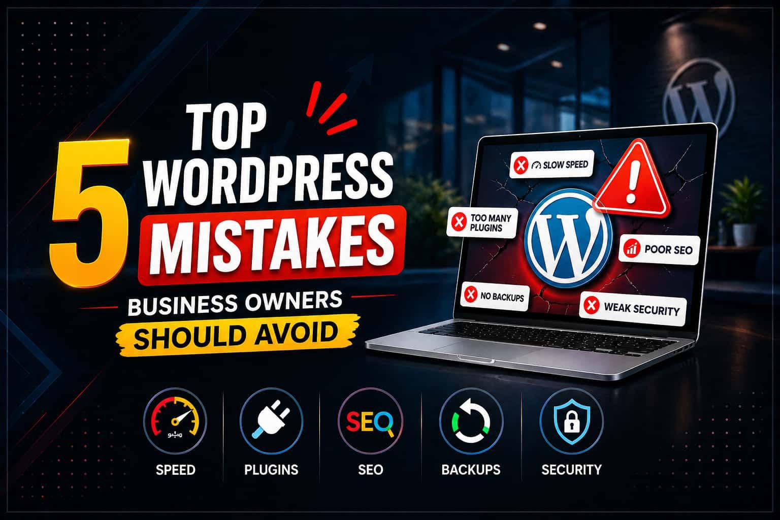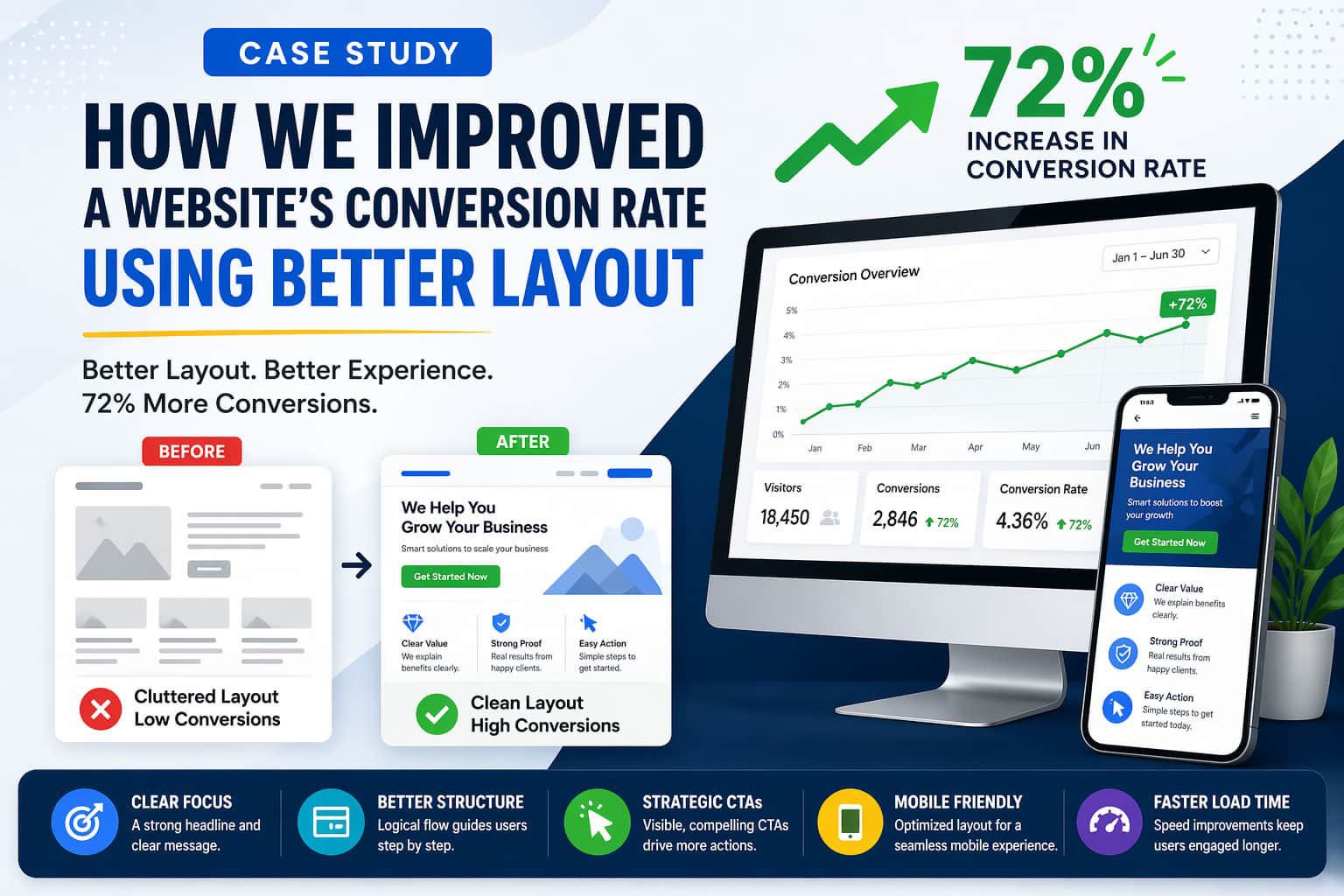


Your website has one important job: turning visitors into customers. However, website mistakes can drive potential customers away before they even explore your products or services. In fact, many people decide whether to stay or leave within the first 10 seconds. If your website is slow, confusing, or outdated, they’ll likely return to the search results and choose a competitor instead.
Fortunately, most website mistakes are easy to fix. By improving your website’s speed, design, and user experience, you can build trust and increase conversions.
In this article, we’ll explore five common website mistakes that make customers leave-and show you how to fix them.
Website Mistakes
1. Slow Website Loading Speed
First, a slow website is one of the quickest ways to lose potential customers. Most visitors expect pages to load within a few seconds. If your website takes too long, many users will leave before reading your content.
As a result, slow loading can increase bounce rates, reduce conversions, and even affect your search visibility.
Common Causes
- Large, unoptimized images
- Low-quality hosting
- Too many plugins
- Heavy scripts and animations
- Poorly optimized code
How to Fix It
Compress your images, remove unnecessary plugins, and choose reliable hosting. In addition, enable browser caching to improve performance.
You should also test your website regularly with Google PageSpeed Insights.
2. Confusing Navigation and Layout
Next, visitors should know where to click without thinking. If your navigation is cluttered or confusing, they’ll quickly become frustrated and leave.
A clean layout makes it easier for users to find information and builds confidence in your business.
Signs of Poor Navigation
- Too many menu items
- Confusing page structure
- Hidden contact details
- No clear call-to-action
- Inconsistent page layouts
How to Fix It
Keep your menu simple and organize your pages logically. Most importantly, make your contact information easy to find and guide visitors toward the next step.
By avoiding these website mistakes, you’ll create a smoother user experience.
3. Unclear Value Proposition
Your homepage should explain what your business offers within seconds. Otherwise, visitors may leave before learning how you can help them.
Instead of focusing only on your company, explain the value you provide. A clear message builds trust and encourages people to keep reading.
Poor Example
“Welcome to ABC Company.”
Better Example
“We Build High-Converting Websites That Help Small Businesses Generate More Leads.”
For example, a benefit-driven headline immediately tells visitors why they should choose your business.
4. Outdated or Unprofessional Design
An outdated website can make even a great business appear less trustworthy. On the other hand, a clean and modern design creates a strong first impression and encourages visitors to stay longer.
Signs Your Website Needs an Update
- Outdated fonts or colors
- Low-quality images
- Cluttered layouts
- Small text
- Broken links
- Poor mobile experience
How to Fix It
Refresh your website with a clean layout, consistent branding, and high-quality visuals. Likewise, review your content regularly to remove outdated information.
If your website gets visitors but not leads, read our guide on Why Your Website Is Not Generating Leads.
5. Weak or Missing Call-to-Action (CTA)
Even if visitors like your website, they may leave without taking action if you don’t tell them what to do next.
A clear call-to-action (CTA) guides users toward the next step, whether that’s contacting your business, requesting a quote, or booking a consultation.
Examples of Effective CTAs
- Get a Free Quote
- Contact Us Today
- Schedule a Consultation
- Book a Free Discovery Call
- Start Your Project
How to Fix It
Place clear CTAs throughout your website, especially on your homepage and service pages. Make them easy to find and use action-oriented language that encourages visitors to take the next step.
Website Mistakes Checklist
Before publishing or updating your website, use this checklist to identify common website mistakes.
✔ Loads in under three seconds
✔ Has a clean and simple navigation
✔ Clearly explains what your business offers
✔ Features a modern, professional design
✔ Includes clear call-to-action buttons
✔ Works smoothly on mobile devices
✔ Makes it easy to contact your business
If you answered “No” to any of these questions, it’s time to make improvements.
You can also learn more about improving website performance by reviewing Google’s Core Web Vitals.
Final Thoughts on Website Mistakes
Every business wants to keep visitors engaged, but even small website mistakes can drive potential customers away.
Fortunately, improving your website doesn’t have to be complicated. By increasing your website speed, simplifying navigation, creating a clear value proposition, updating your design, and adding strong calls-to-action, you can create a better experience for every visitor.
Start fixing these website mistakes today, and you’ll be well on your way to generating more leads, building trust, and growing your business.