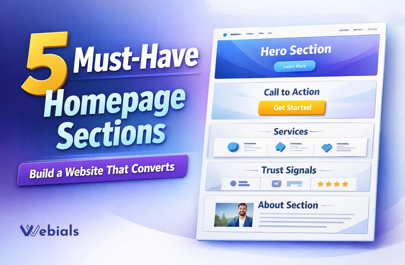
Your homepage is more than just a landing page – it’s the foundation of your entire website. When visitors land on your site, they decide fast. They choose whether to stay or leave. That decision often depends on how well your homepage sections are structured. According to usability research by Nielsen Norman Group, users form an opinion about a website within seconds, which makes your homepage structure extremely important.
If your homepage is confusing, cluttered, or missing key elements, you’re losing potential clients every day. In this guide, you’ll learn the 5 essential homepage sections every business website must have to improve user experience, build trust, and increase conversions.
If you’re still working on your website basics, you can also check our previous guide on building an SEO-friendly website from day one.
1. Hero Section: The Most Important Homepage Section
The hero section is the first thing visitors see when they land on your website. It plays a critical role in shaping their first impression.
First, a strong hero section clearly explains what your business does and who it helps. It should immediately answer the visitor’s main question: “Is this for me?”
Keep your message simple and direct. Avoid vague or creative phrases that confuse users.
What to include in your hero section:
- A clear and benefit-driven headline
- A short supporting subheadline
- A primary call-to-action button
- A clean visual or image
A well-optimized hero section helps visitors stay longer and explore the rest of your homepage sections.
2. Call-to-Action: A Must-Have Homepage Section
Every effective homepage guides visitors toward a specific action. That’s where your call-to-action (CTA) comes in.
Without a doubt, without a clear CTA, users may feel lost and leave your website without taking any step.
Your CTA should be visible, direct, and action-oriented.
Examples of strong CTA buttons:
- Get Started
- Book a Free Consultation
- Request a Quote
Avoid adding too many different CTAs. Instead, focus on one primary action and repeat it across your homepage sections.
This approach reduces confusion and increases conversion rates.
3. Services Overview Homepage Section
Next, once visitors understand what you do, they want to know how you can help them. The services section shows your core offerings. It should be simple and structured.
Keep this section clean and easy to scan. Most users won’t read long paragraphs-they will skim.
Best practices for this section:
- Highlight 3 to 6 key services
- Use short descriptions
- Add icons or visuals for clarity
- Link each service to a detailed page
This is one of the most important homepage sections because it connects your business with your visitor’s needs.
4. Trust Signals Homepage Section
Additionally, trust is a major factor in online decision-making. Visitors want to know if your business is credible before taking action.
That’s why adding trust signals is essential. Strong trust signals build credibility. They make your website feel more reliable.
Examples of trust signals:
- Client testimonials
- Reviews and ratings
- Client logos
- Case study results
- Certifications or awards
Place this section strategically – ideally near your CTA – to strengthen your conversion chances.
Among all homepage sections, this one directly impacts whether a visitor decides to trust you or not.
5. About or Process Homepage Section
Finally, people don’t just care about what you do – they also want to know how you do it.
An “About” or “How it works” section helps visitors understand your process and feel more confident about working with you.
Keep it simple and structured.
Example process:
- Discovery
- Strategy
- Execution
This section removes confusion and makes your services feel more accessible.
It’s one of those homepage sections that quietly builds trust and improves user experience.
Common Mistakes to Avoid
However, even if you include all the right homepage sections, small mistakes can reduce their effectiveness.
Here are a few common issues to avoid:
- Writing unclear or generic headlines
- Using too many CTAs
- Overloading the page with text
- Ignoring mobile responsiveness
- Not guiding users toward a goal
Focus on clarity, simplicity, and structure.
Conclusion
Your homepage is not just about design – it’s about performance. By including the right homepage sections, you create a clear path for your visitors to follow.
Let’s recap the essentials:
- A strong hero section
- A clear call-to-action
- A structured services section
- Trust-building elements
- A simple process or about section
When these homepage sections work together, your website improves. It becomes more engaging and trustworthy. It also converts better.
If your current homepage isn’t delivering results, start by improving these sections – and you’ll notice the difference.