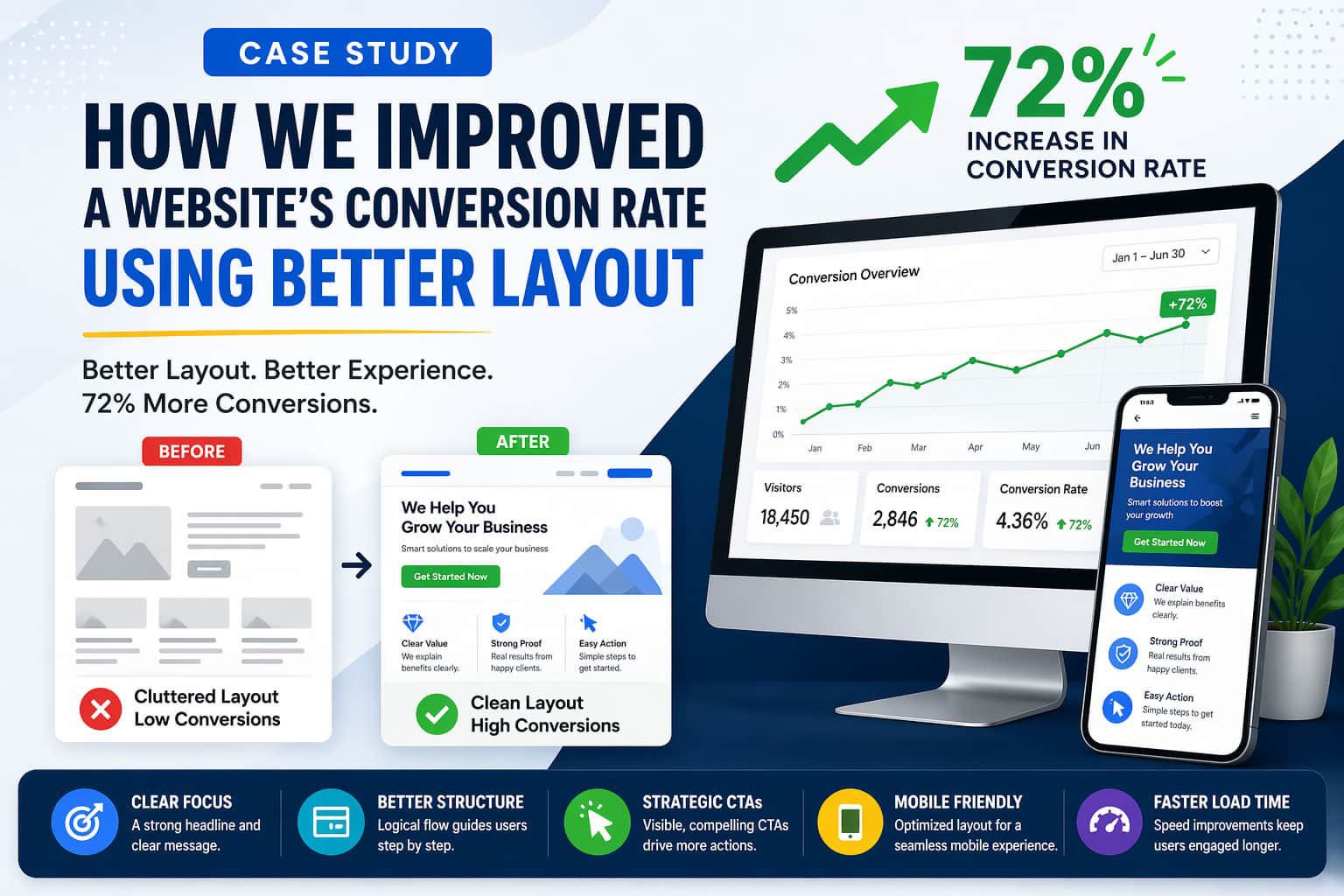
Website conversion rate improvement is often easier than getting more traffic. In this case study, we show how a simple layout redesign increased conversions by 72%.
Many websites struggle with conversions. However, the real issue is not traffic. Instead, the problem is poor structure and unclear user flow.
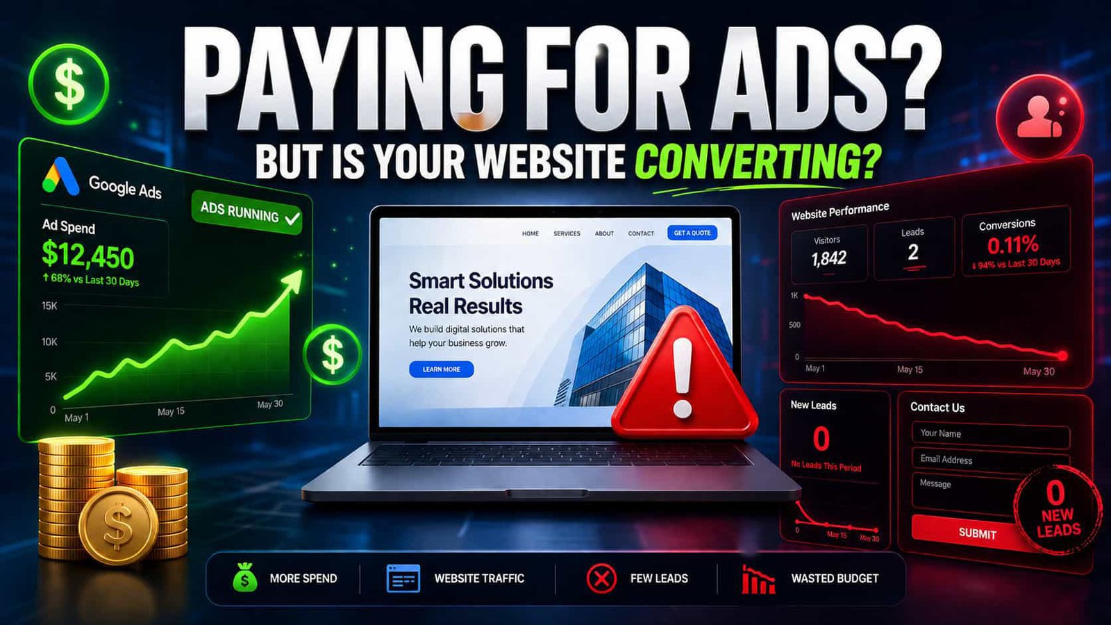
🚨 The Problem: Traffic Was Not Converting
At first, the website looked fine. However, users were not taking action.
After analyzing the data, we noticed several issues.
- Visitors left within seconds
- Call-to-action buttons were hard to see
- The layout felt cluttered
- Key information appeared too late
As a result, users lost interest quickly.
🔍 Step 1: Layout Audit and User Behavior Analysis
To begin with, we conducted a full layout audit. Then, we reviewed user behavior using heatmaps.
We focused on:
- Visual hierarchy
- Content flow
- Scroll behavior
- Mobile experience
Interestingly, most users never scrolled past the first section.
✨ Step 2: Improving the Above-the-Fold Section
Next, we redesigned the top section of the page.
First, we added a clear headline. Then, we introduced a strong value proposition. After that, we placed a visible CTA button.
In addition, we removed unnecessary text.
Because of these changes, users immediately understood what to do.
🔄 Step 3: Creating a Logical Content Flow
Previously, the page felt random. Therefore, we reorganized the layout.
We followed a simple structure:
- Problem
- Solution
- Benefits
- Proof
- CTA
As a result, users could follow the message easily.
🎯 Step 4: Better CTA Placement
Earlier, the website had only one CTA. However, most users never reached it.
So, we added multiple CTAs across the page. Moreover, we used contrasting colors and larger buttons.
Consequently, users started clicking more.
📱 Step 5: Mobile Optimization
Today, most users browse on mobile devices. Therefore, mobile optimization was essential.
We improved:
- Button size
- Font readability
- Section spacing
- Sticky CTA
Because of this, mobile users stayed longer and engaged more.
⚡ Step 6: Speed Optimization Matters
Although layout was the main issue, speed also played a role.
So, we optimized:
- Image sizes
- Scripts
- Caching
If you want to fix speed issues, read our previous guide: WordPress speed issues.
Faster loading improved user experience instantly.
📊 Final Results
After all improvements, the results were clear.
- 72% increase in conversions
- Lower bounce rate
- More CTA clicks
- Better engagement
Therefore, layout changes had a direct impact.
💡 Key Takeaways for Website Conversion Rate Improvement
If you want website conversion rate improvement, focus on these:
- Keep your layout simple
- Guide users clearly
- Place CTAs strategically
- Optimize for mobile
- Improve speed
Most importantly, design for users, not just visuals.
🔗 Expert Insight
According to Nielsen Norman Group, users leave quickly if they don’t find value immediately.
Therefore, your layout must communicate fast.
🚀 Final Thoughts
In conclusion, better layout leads to better results.
Small changes can create big improvements. So, instead of chasing more traffic, optimize what you already have.